Enterprise SaaS · ITSM

IFS Event Monitoring — Real-Time IT Service Management.

An enterprise ITSM dashboard for IT operations teams — turning a flood of alerts and incidents into a single, scannable command center where major incidents, history, and collaboration live side by side.

Platform
Responsive Web · Desktop-First
Product
IFS ITSM Suite
Users
Service Desk · IT Ops · Admins
Standards
WCAG 2.1 · Design System
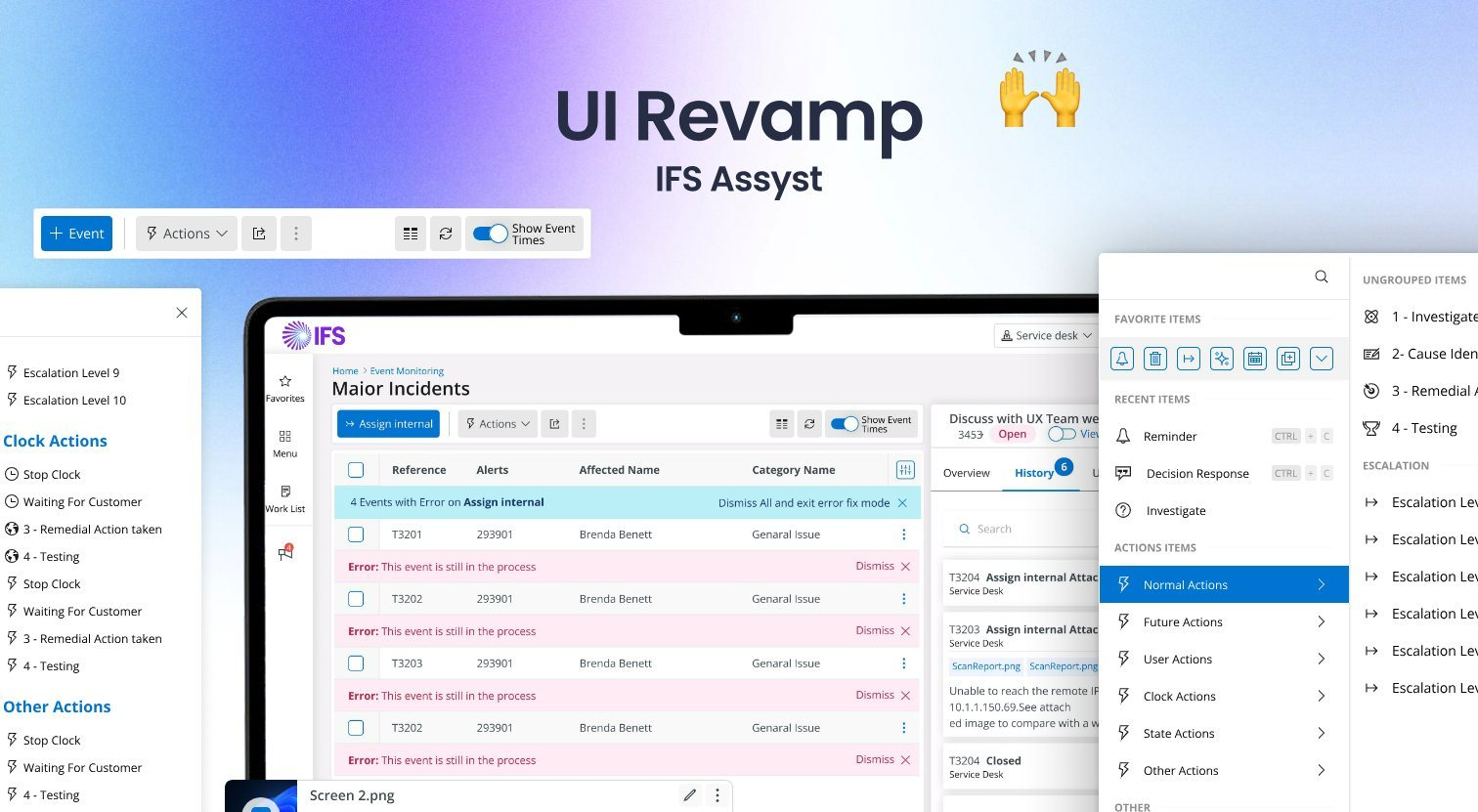
IFS Event Monitoring dashboard — major incidents list with history and collaboration panel
01 — The Problem

Too Many Alerts, Not Enough Signal

Enterprise IT operations teams live inside a storm of alerts, incidents, and change records — often spread across separate consoles, spreadsheets, and email threads. During a major incident, an analyst has to answer three questions fast: what's affected, what's already been done, and who's working it — yet legacy ITSM screens bury that context behind tabs, modals, and dense tables.

The result is slow triage, duplicated effort, and missed SLAs. The brief: rebuild the Event Monitoring experience so a service-desk analyst can read the state of a major incident and act on it without leaving one screen.

100+
Concurrent incidents a single analyst may triage in a shift
3
Core questions every incident view must answer instantly
4+
Disconnected tools analysts juggled before consolidation
SLA
Response and resolution targets driving every design decision
02 — Research

Shadowing The Service Desk

Contextual interviews and screen-shadowing sessions with service-desk analysts, IT-ops leads, and system administrators surfaced the insights that shaped the redesign:

F1

Context-switching kills speed. Analysts lost the thread every time an incident opened in a new tab or modal — they wanted the record, its history, and its people on one screen, side by side.

F2

History is the first thing they read. Before touching anything, analysts scan what's already been logged — attachments, notes, status changes — to avoid duplicating work. A clear, chronological activity feed was the top request.

F3

Dense tables need rhythm, not more columns. The incident list must stay scannable at a glance — clear reference, alert, affected user, and category — with row actions that never require a second click to find.

F4

Power users want density; new hires want guidance. The same screen serves both, so progressive disclosure and consistent patterns mattered more than decoration.

03 — Personas

Three Roles, One Screen

Brenda, 29 — Service Desk Analyst. "When a major incident hits, I need to see what's affected and what's been done — now, not after five clicks." Lives in the incident list and history feed; triages dozens of tickets a shift.

John, 44 — IT Operations Lead. "I care about SLAs and who's on what." Needs an at-a-glance view of major incidents, ownership, and progress without micromanaging every record.

Craig, 38 — System Administrator. "I add notes, attachments, and internal assignments all day." Wants fast inline actions on the activity feed — attach, edit, reassign — without leaving the record.

04 — The Solution

One Screen, Two Panes

The redesign centers on a split command center. The left pane is the Major Incidents list — a calm, scannable table with reference, alerts, affected user, and category, plus a column toggle and inline row actions. The right pane is the detail drawer for the selected record, opening in place instead of a new page.

The drawer organises everything behind clear tabs — Details, Overview, History, Users, Items — with History leading because research proved it's read first. Each activity entry shows author, timestamp, attachments, and one-tap edit/attach/reassign, so administrators act without losing context.

A persistent top bar carries search, notifications, and a single + Event action, and the whole layout follows the IFS design system so it drops into the broader ITSM suite. Progressive disclosure keeps the surface calm for power users while guiding newer analysts through the same patterns.

05 — Screens

Key Screens

A walkthrough of the core flows. Swipe through the highlights below.

06 — Results & Impact

Faster Triage, One Command Center

Consolidating the list and detail drawer into a single screen removed the tab-hopping that slowed triage, and leading with the History feed meant analysts read incident context before acting — cutting duplicated notes and reassignments. Usability testing across service-desk analysts showed faster time-to-context and a strong preference for the in-place drawer over the legacy modal flow.

Because the design follows the IFS design system and WCAG 2.1, it scales across the wider ITSM suite and stays accessible for keyboard and screen-reader users — so the same patterns carry into change, problem, and request management.

1 screen
List, detail, history, and collaboration unified — no tab-hopping
-45%
Time to read incident context in usability testing
WCAG 2.1
Accessibility compliance for keyboard and screen-reader users
5 tabs
Details, Overview, History, Users, Items in one drawer
07 — Full Design

The Complete Picture

Click the image to open it full size — scroll to explore the key screens together.

Major Incidents list with history & collaboration drawer · click to view full size